How to navigate?
How to navigate?
I recently visited a website page and suddenly was locked to close the cookie window bar by a pop-up window for the chat agent "assistant".
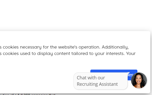
This is a website of a huge telecom, and as you can see the two CTAs are overlapping.
I tried to expand the chat agent to see if I can have space to click to the blue cookie window and to close it but it was not possible.

After this experience I decided to spend a few more minutes and found a way: on the left side the cookie window has the option to choose an option for your settings which opens a new window and finally you can hide this cookie settings po-up.
There is no way you can hide or close the chat assistant icon and text.
Is that a good example of user experience?
As a web and marketing expert I am afraid that this is a common mistake by web developers, UX designers, and all related to create a good and flawless navigation for the visitors.
Where can we find the missteps here?
- Is it the owner that asked for this end product?
- No one tested the page?
- It is working well, but it is not a big deal in the end?
- When will someone internally catch it? UX audit, maybe?
These open questions bothered my mind for half an hour...


Comments